42
Amanda Coolidge; Sue Doner; Tara Robertson; and Josie Gray
Organizing content so it has a logical flow just makes sense. Using chapters, headings, and sub-headings to organize a resource allows students to clearly see how the main concepts are related. In addition, headings are one of the main ways that students using a screen reader navigate through a chapter.
Who are you doing this for?
Everyone benefits from having content that’s clearly organized. Well-organized content supports students who:


Why is this important?
Headings help to identify the hierarchical structure of a document (e.g., sections, sub-sections). They provide a visual cue that helps sighted readers quickly navigate through sections of a document, skimming until they find the section they are looking for. Similarly, headings create logical divisions in the content and allow a non-sighted user to navigate a page or document easily using a screen reader.
When it comes to using visual references to indicate the hierarchy and structure of a document, you might be accustomed to changing the font style, enlarging the type size, or highlighting the text with bold, underline or italics to create the impression of a heading. This approach presents problems when creating material with accessibility in mind because screen readers won’t identify the text as a heading. Instead, the screen reader will just “read” through the text of a heading as if it were regular content, missing your intended cues about structure and organization.
What do you need to do?
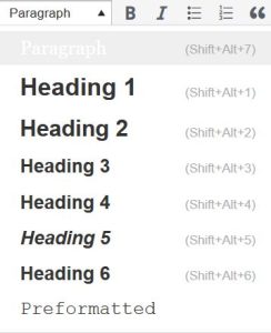
In Pressbooks, use the visual editor to tag sections with Heading 1, sub-sections with Heading 2, sub-sections of sub-sections with Heading 3, and so on.

Media Attributions
- Ann: Original artwork by Hilda Anggraeni (BCcampus). © Creative Commons Attribution 4.0 International Licence.
- Jacob: “WFE003: Jacob” by Rosenfeld Media. © Creative Commons Attribution 2.0 Generic Licence.

